Lipa Agate

Designed by Ermin Međedović. Released 2014.

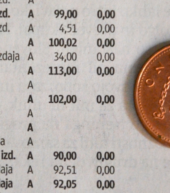
Lipa Agate is a two-height sans cleverly designed for clarity in the smallest text sizes. It focuses on microtypography, which is setting text at the smallest of scales — meaning type as small as 5–10 points. Lipa Agate is a space-saving solution with distinct glyphs and a modern look for jobs requiring minutiae without jeopardising legibility.

  • Diploma, Rutenia 2014
  • Fontshop’s Best of 2014 
  • Typefacts Best of 2014 
  • Typographica’s Notable Releases of 2014
  • Silver, 2014 European Design Awards
Lipa Agate High Set. 12 fonts USD 379,36
Lipa Agate Low Set. 12 fonts USD 379,36
Change Font Settings

Big Promise in a Small Package

Click to Edit
Change Font Settings

Scientists discover a way to genetically engineer ribosomes, the molecule-building factories in all cells, which could provide a way to build the tiny machines of the future.

Click to Edit
Change Font Settings

Inside every living cell are molecule-building factories called ribosomes. These tiny machines read blueprints of genetic information and fabricate the molecules that make up all life. They are hugely important to genetic engineers and researchers, because controlling ribosomes could be the way to synthesize the custom-made biological nano-machines of the future—ones that could make anything from therapeutic human antibodies to the next generation of unfathomably complex super-materials.

There's a problem: Engineering a ribosome to do interesting tricks often means paralyzing and killing its parent cell. But today, a team of biologists and biological engineers at Northwestern University and the University of Illinois have made a fascinating breakthrough that could help scientists get around this roadblock.

Click to Edit

As they report in a new study in the journal Nature, the scientists have created unique, experimental ribosomes they're calling Ribo-T that are the first ever to passively co-exist with a living cell's natural ribosomes. It means that for the first time, researchers will be able to tinker with ribosomes in living organisms, such as bacteria, without worrying about killing the lifeforms they're studying.

"You can think of it like this: Imagine you only have one family car and you want to start modifying it, say, putting a truck bed in," says Alexander Mankin, a biologist with the team at the University of Illinois. "This is the same with these ribosomes. But here, [having Ribo-T] is a bit like having two cars, instead of one." So you can modify Ribo-T in any way you want without worrying about destroying the whole setup, he says.

Click to Edit

The Backstory

Lipa Agate

A two-height sans cleverly designed for clarity in the smallest text sizes.

Lipa Agate, taken from the name of the Slovenian national tree Linden, is the first salvo in an extensive type system by Ermin Međedović that will be rolled out over time. This first offering is part of a much larger coherent type system which was developed over the course of ten years. Lipa Agate focuses on microtypography, which is the ability to set text at the smallest of scales. The concept is simple: Ink spreads when it is put on paper, so taking out some ink at the joins of glyphs limits ink-spread to keep small text from looking blobby and illegible. The smaller the text, the worse the problem — meaning type as small as 5–10 points — such as in album liner notes, sports scores, footer details for film posters, data tables, or any other job requiring minutiae without jeopardising legibility. Lipa Agate is a space-saving solution with distinct glyphs and a modern look.

Lipa Agate comes in two primary versions, High and Low, which differ in the lowercase x-height and ascender height but keep the same width. Lipa Agate Low’s x-height keeps the ascenders at cap height, giving blocks of text a comparatively wider and squarish feel. Lipa Agate High has ascenders that are taller than the capital glyphs while the x-height is raised intriguingly close to the (unchanged) cap height. Text set in the High version obviously has a taller look, but it also attains more overall texture due to the varying heights along the top of each line.

Contemporary editorial design requires a high amount of flexibility to respond to various design situations in a consistent fashion. Thankfully Lipa Agate comes in regular, narrow, and condensed proportions, allowing the bold designer to set text tightly without sacrificing clarity.

With its wide current range of 24 styles and many OpenType features (small caps, arrows, info-numerals, fractions, arrows, and dingbats, stylistic alternates, and much more), Lipa Agate is ready to take on every detail. The complete Lipa Agate family, along with our entire catalogue, has been optimised for today’s varied screen uses.
About Us

TypeTogether is an indie type foundry committed to excellence in type design with a focus on editorial use. Additionally, TypeTogether creates custom type design for corporate use. We invite you to browse our library of retail fonts or contact us to discuss custom type design projects.